A step by step guide to using photos and imagery on your dog training website


In today's visually-driven world, selecting and optimising the right images for your dog training or animal behaviour website has never been more important.
You’d think that, compared to everything else that goes into making a website, choosing a few pictures would be the easy part. But, in fact, the only thing that’s easy about it, is getting it wrong!
Now, you might be thinking so what?! Does it really matter? People are paying for your expertise in helping them with their pet, not your eye for aesthetics.
Well, whilst that’s true, your website (and the images you use on it) have the potential to impact on whether someone is even interested in finding out more about your professional expertise.
Whether you like it or not, humans just can’t seem to help themselves from ‘judging a book by its cover’ when it comes to websites. So much so that 83% of the participants in one study looking into the impact of design on perception of ‘trustworthiness’ rejected a website due to design factors, such as an unfavourable first impression of look and feel. Pretty superficial, huh?
Whilst there’s waaay more to website design than just imagery, that’s what I’m going to focus on here. From capturing attention to conveying your brand's message and evoking an emotional response, imagery plays a vital role in shaping the user experience. And it’s not just aesthetics… your website imagery can help support the message of your copy (the words you’re using), make it easier for users to navigate around your site (eg. with icons that indicate options) and impact - positively or negatively - on your Search Engine Optimisation.
So, let’s explore how to get it right when choosing and optimising your website imagery.
Step 1: Defining your brand
To create a cohesive visual experience on your website, it's crucial to define your brand's personality, values and aesthetic. If you’ve previously done some brand strategy work, this should directly relate to how you can best appeal to your target audience.

Consider the following:
Personality: Define the overall vibe and tone of your brand. Is it friendly, professional, playful or authoritative? This will help you select images that align with your brand's character.
Values: Identify the core values and principles that your brand represents. This will guide you in choosing images that reflect and reinforce these values.
Aesthetic: Determine the visual style that represents your brand. For example, is it minimalist, bold, bright, rustic, simple, modern, vintage or vibrant? Establishing a consistent aesthetic ensures image consistency throughout your website.
Step 2: Sourcing high quality images
There are lots of different types of images that you can use on your website. As well as photos, you could also consider icons, illustrations and patterns. Just be sure that they all work together towards the overall ‘vibe’ that you want to create or it’ll end up looking a mess!
So, where do you find them?
Photography:
You might take some yourself or (particularly of you and your own animals) or pay a pro to take some for you.
There are plenty of paid options on stock photography sites (eg. Shutterstock). Luckily, there are now lots of free to use stock images available too… it can just take you a while to trawl through them to find the right ones for you. Take a look at Pexels and Unsplash.
Canva also has an image library, as well as some rather handy editing tools.
Icons, Patterns and Illustrations:

Canva is pretty good for these kind of things if you don’t want/ need something bespoke. Just search in the library of elements and you’ll find loads!
Another option is to scour Etsy or Creative Market. There are lots of great graphic designers and artists on here, selling very inexpensive icons and illustrations. Or, if you’re talented in that way, why not create your own?
Step 3: Choosing the right images
Great, so now you know where to find them, how on earth do you choose from all of those options? Just keep these three rules in mind…
1. Every image needs to be fit for purpose
This means that they should be:
Good quality (ie. clear and sharp when viewed on your website, even on a larger screen). No blurry shots that you took on a ‘fun camera’ ten years ago (I’m showing my age… do ‘fun cameras’ even exist any more?!).
The right orientation (portrait or landscape) if it’s to go in particular place on your website. There’s no point setting your heart on a gorgeous image to use as a section background if, when used on a wide screen, it just results in someone’s head being cut off.
2. Consider how you want your brand to be represented
For images of you, don’t worry about looking ‘perfect’ and feel free to add some personality (you don’t want it looking like a corporate headshot) but maybe steer clear of having piles of washing up and an overflowing bin in the background 😉
For images of animals (stock images or your own), you’ll obviously want to steer clear of any in which they appear stressed, although admittedly it can sometimes be hard to tell from a still image… but you just know that someone will love to point it out! 🙄 Also, when going through stock images, look out for sneaky shock collars or cropped ears and decide on your stance about pics of brachycephalic dogs. These decisions are up to you, but they are decisions that you need to make.
3. Ensure consistency of style
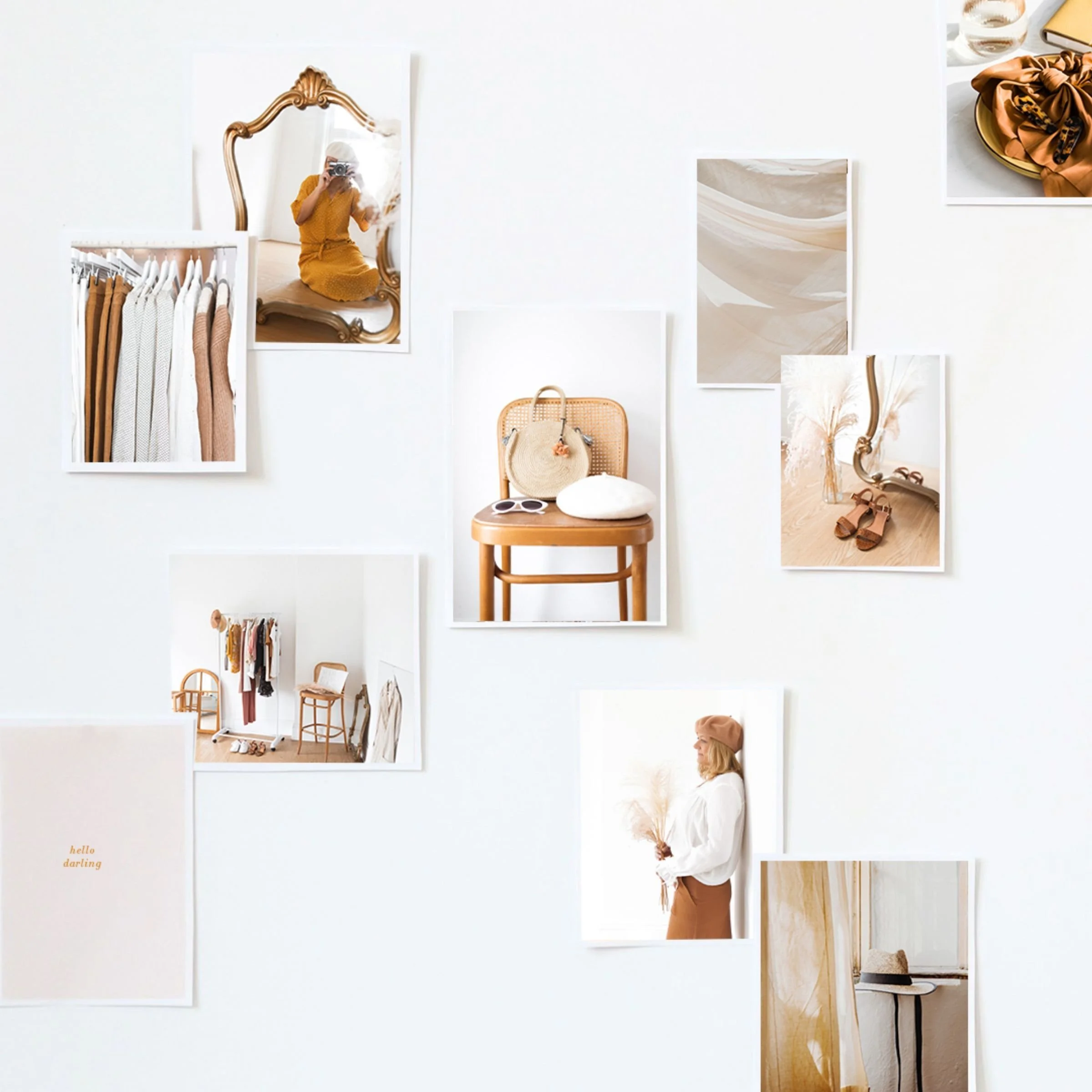
In terms of photos, you’ll probably want to choose between cut-out/ studio images (with plain backgrounds) or lifestyle images (where there is more of a context eg. a dog on a sofa or out on a walk). The right choice for you will depend on the overall ‘vibe’ you’re going for. You can combine these two styles but you need to have a skilful ‘eye’ to get this right.
For icons, try to avoid having some with really thick lines if others are more delicate (or vice versa) and decide whether you want to go for a hand-drawn, illustrative feel or something that’s more standardised/ neat and then stick with it throughout. See an example of a mis-matched collection of icons below.

Compare the set above with the two below. Note how the consistency of style, fill and line width helps the icons within each of these sets feel more cohesive.


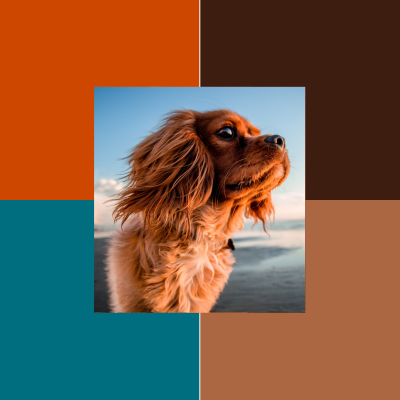
Finally, you need to think about your brand’s colour palette and choose images that will fit well with that. For example, if your brand colours are warm, rich tones, then adding a washed-out pastel photo will look pretty awful.
Equally, photos that include a bright grassy green or vibrant warm colours really jar when used on a site that generally has more subtle and pared back colours.
Look at the images below to see examples of what ‘works’ and what doesn’t.

Not great! Looks really jarring.

The background colours look insipid.
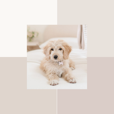
A much more cohesive fit.
All elements feel rich and warm.
There’s a bit of an eye for getting this right but you might find it helpful to think about whether your brand colours are generally warm or cool and whether they are saturated or muted and then use that to guide you. You can also use image filters to help you adjust photos that aren’t quite right and the Lightroom app is surprisingly good for something that’s free!
Step 4: Optimise your images for web performance
To ensure fast loading times, you’ll need to optimise your images. Consider the context and purpose of each webpage when selecting image sizes. Large, high-resolution images may be suitable for featured sections or portfolio showcases, while smaller sizes may be appropriate for thumbnails or blog post snippets.
Generally, I’d aim for the following dimensions:
Hero banners or full width section backgrounds: 2000px wide by 1080px high
General images: usually between 1500px and 500px on the longest side (depending on where it’s used)
Icons/ Thumbnails: 200px x 200px
You should also compress your images to reduce file size without compromising image quality. This will improve loading speed and overall user experience. You’re aiming for an image file size of under 100 KB for smaller images and under 500 KB for larger images.
N.B. It’s best to download icons and illustrations as PNGs with transparent backgrounds so that you can use them on any colour section of your website, without ending up with a strange white box around them! But be aware that PNGs are ‘bigger’ files than JPEGS so only use PNGs where you need them (i.e. where you need to be able to have a transparent background to the image).
Want to know exactly what I do?
Get any large images and use Bulk Image Resizer to make them all 2000px on the longest edge (make sure that none of them are less than this to begin with or it will stretch them to 2000px – not what you want as this will make them pixelated and blurry!).
Run the resized files through this free online image compressor tool.
Personally, I then check that none are above 500kb. If they are, I reduce the size further and re-compress. I also see if there are any between 200 – 500kb that actually only need to be quite small on the screen as I can usually resize and recompress those again further now I know where they’re being used.
Step 5: Enhance accessibility and SEO-friendliness
Once you’ve got your images ready, you need to do two more things:
1. Name your images
The good news is, that if you use some of your keywords in your image file name, this can help you come up in online searches because, whilst google can’t see images, it can read files names. So, instead of 'photo_135b6352', you might call an image 'reactive-dog-class-bedford' or 'your-business-name-puppy-training-manchester’… or whatever.
2. Add alt text
Finally, once installed onto your site, you should add descriptive alternative text (alt text) to your images. Alt text should provide a descriptions that conveys the image’s content. This benefits visually impaired users relying on screen readers and helps search engines to understand the image.

By following the step-by-step guide shared here, you can take a strategic approach to the use of imagery on your dog training/ animal behaviour website so that it can get working harder for you!
Is your website due a makeover?
If you worry that your website isn’t presenting you and your business in the best possible light, I have just the thing (… well, things!) to help you.
Book a website audit
Get my eyes on your site - I’ll review your site and share a personalised audit checklist and video recording for you to watch and action when it suits you. With constructive feedback and actionable advice throughout, you’ll know exactly what tweaks to make, to get your website working harder for you. I’ll even provide a customised action plan to help keep you on track. Find out more here.
Purchase a website template
Fancy having a brand new website which is not only gorgeous but also strategically designed to help you win over your ideal clients, without paying for a fully bespoke design? Well, you can! Choose from my collection of website templates and you’ll have a winning website, underpinned by business strategy… and all within in a fraction of the time it would take you to create a DIY site. That’s what I call a win-win! Find out more here.
GO FOR THE FULL MONTY
If you’re ready to really elevate your business at every level, check out my bespoke brand and website design service. With a proven, strategic five-step process, it’s uniquely comprehensive and industry-specific, to reflect your brilliance throughout your business. With no ongoing maintenance fees and copywriting guidance included, it really is one-of-a-kind. Find out more here.
Please feel free to share this article…
READ MORE Posts like this ONE